Exercise frequency and 12-year mortality with and without diabetes: a U-shaped dose–response from Cox models
How entering exercise frequency as categories rather than a single slope lets a Cox model show a U-shaped curve, why estimating it separately for people with diabetes moves the bottom of that curve, and what three sequential adjustment models reveal about the people who exercise every day.
Regular exercise is one of the most consistent predictors of a longer life, and for people with diabetes it is part of the treatment itself. The practical question is how much. Is more always better, and is the best frequency the same for someone with diabetes as for someone without? Studies of physical activity and mortality usually look at the general population or at a diabetes population on its own. Few compare the two groups in the same data with the same definitions, and that is the only way to see whether the shape of the relationship differs between them.
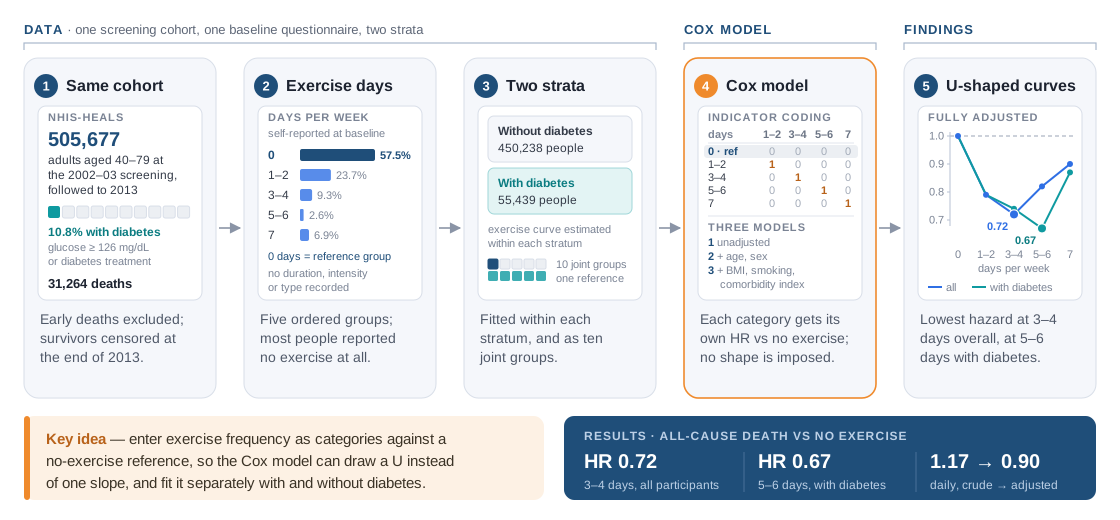
The study used the same national screening cohort as the companion write-up on diabetes and household income: 505,677 Korean adults aged 40–79 at the 2002–2003 national health screening, followed to the end of 2013, after excluding people with missing diabetes status or BMI and those who died in the first three years. Diabetes, present in 55,439 people (10.8%), meant treatment for diabetes or a fasting glucose of at least 126 mg/dL. Exercise frequency came from the screening questionnaire as days per week, grouped as 0, 1–2, 3–4, 5–6 and 7. More than half of the participants (57.5%) reported no exercise at all, and only 2.6% exercised on 5–6 days. Over the twelve years, 31,264 participants died.
The association was U-shaped. In the fully adjusted model for all participants, exercising on 3–4 days a week went with the lowest hazard of death against no exercise (HR 0.72), while exercising every day came out at 0.90. Among people with diabetes the lowest hazard moved to 5–6 days a week (HR 0.67). With the first author I carried out the formal analysis: the Cox proportional hazards models for each exercise category, estimated for all participants and separately by diabetes status, which is what lets the nonlinear pattern and the subgroup difference show. This post is about how a categorical exposure lets the model draw that curve, and about what the three sequential adjustment models reveal.
Same cohort, a different exposure
The design inherits the strengths of the national cohort, with linked screening, claims and death records, objective diabetes status and deaths from the national registry, and adds one weakness: the exposure is a single self-reported number. The questionnaire asked how many days a week a person exercised, not for how long, how hard or what kind, and it was asked once, at baseline, although habits can change over twelve years.
The five groups also differed in ways that matter for mortality. People who exercised every day were the oldest group (mean age 56.4 years, against 50.6 for those exercising 1–2 days a week), had the highest share of three or more comorbidities (18.0%) and more often had low household income than people exercising on one to six days. Daily exercise was also more common among people with diabetes (9.35%) than without (6.61%), and the authors suggest that people who exercise every day may be more worried about their health. Any crude comparison by exercise frequency mixes these differences with the effect of exercise itself.
Categories, not a slope
The model is the same Cox proportional hazards regression as in the companion post: a baseline hazard that is never given a shape, multiplied by exp(β·x), fitted by comparing each death with everyone still at risk, with people alive at the end of 2013 treated as censored. What changes is how the exposure enters x.
Exercise frequency was entered as a categorical variable with no exercise as the reference: four indicator terms, one each for 1–2, 3–4, 5–6 and 7 days, each with its own coefficient. Every hazard ratio is therefore a direct comparison with people who did not exercise, and the five estimates together form a dose–response curve whose shape the data choose. A single linear term in days per week would have forced the log hazard to fall, or rise, by the same amount for every extra day. It would have averaged the steep early drop and the later rise into one modest slope, and the U-shape, the main finding, would have been invisible. With only five ordered levels and half a million people, categories are the natural way to avoid imposing a shape. The price is precision in sparse groups, visible in the wide interval for the 1,374 people with diabetes who exercised on 5–6 days.
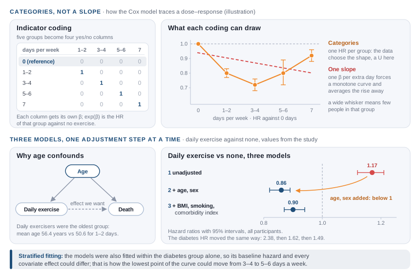
The second design choice is stratification by diabetes. Besides the model for all participants, the analysis was repeated within the diabetes group alone, so its baseline hazard and every covariate effect could differ from those of people without diabetes. That is the most flexible way to ask whether the curve has a different shape in a subgroup. The article also shows the ten combinations of diabetes status and exercise frequency against a single reference, people without diabetes who did not exercise, the same joint-exposure idea as in the income study.
Three models, one adjustment step at a time
Each estimate was reported from three sequentially adjusted models: model 1 unadjusted, model 2 adjusted for age and sex, and model 3 additionally adjusted for smoking, BMI and the Charlson comorbidity index. Reading across the three shows where the confounding sits.
The daily exercisers show it most clearly. Unadjusted, their hazard of death was higher than that of people who never exercised (HR 1.17). After adjustment for age and sex it fell below one (0.86), and the remaining covariates moved it little (0.90). Adding age and sex did most of the work, and age is the obvious driver: it is the strongest determinant of death in a cohort aged 40 to 79, and daily exercisers were the oldest group, so the crude comparison was partly a comparison of ages. The hazard ratio for diabetes shrank in the same way, from 2.38 unadjusted to 1.62 with age and sex and 1.49 fully adjusted, because people with diabetes were older and had more comorbidity.
Even after full adjustment, daily exercisers had a higher hazard than people exercising on 3–4 days. The authors consider harm from too much exercise unlikely to be the main explanation and point instead to residual confounding: people who exercise every day more often had low income and more comorbidity, and might have been more worried about their health to begin with. Adjustment can remove what is measured; it cannot remove whatever made people start exercising every day.
Results
| Exercise days per week | All participants, HR (95% CI) | With diabetes, HR (95% CI) |
|---|---|---|
| 0 | 1.00 (reference) | 1.00 (reference) |
| 1–2 | 0.79 (0.76–0.81) | 0.79 (0.74–0.85) |
| 3–4 | 0.72 (0.69–0.76) | 0.74 (0.67–0.81) |
| 5–6 | 0.82 (0.76–0.89) | 0.67 (0.56–0.79) |
| 7 | 0.90 (0.87–0.94) | 0.87 (0.80–0.94) |
All estimates are from model 3, adjusted for age, sex, BMI, smoking and the Charlson comorbidity index. Every frequency of exercise was associated with lower mortality than none, in both groups. The combined analysis of the ten groups, adjusted for a slightly different set (sex, age, hypertension, total cholesterol, smoking and comorbidity), points the same way: against inactive people without diabetes, people without diabetes exercising on 3–4 days had the lowest hazard, 0.69 (0.65–0.73), and people with diabetes exercising on 5–6 days came out at 0.93 (0.78–1.10), an interval that includes one. In other words, people with diabetes who exercised on 5–6 days a week had a hazard of death no higher than that of inactive people without diabetes. The authors read this as support for encouraging people with diabetes to exercise more often than people without it.
What I learned
Let the categories speak before fitting a shape. A single slope would have answered "does more exercise help?" with a confident yes and missed the most interesting part of the curve. When an exposure has a handful of ordered levels and the sample is large, indicator coding against a sensible reference is the honest first model; a smooth curve or a trend test can come once the shape is known.
Watch an estimate change sides as you adjust. The daily exercisers moved from a higher to a lower hazard than non-exercisers once age and sex entered the model. Reporting all three models, rather than only the last one, showed exactly where the confounding was, and why the crude numbers should never be used to advise anyone.
A different minimum in two strata is not yet a tested interaction. Among people with diabetes, the intervals for 3–4 days (0.67–0.81) and 5–6 days (0.56–0.79) overlap substantially, and the two sets of models were reported side by side rather than compared formally. The shift is a plausible signal, not a proven difference. Today I would add an exercise-by-diabetes interaction test in a single model, or estimate the difference between the two curves with its own confidence interval.
Limitations
- Exercise was self-reported once, at baseline, as days per week only, without type, duration or intensity, and later changes in exercise habits were not evaluated.
- The cohort represents people who attended national health screening, not the unscreened population.
- Without information on glycaemic control, the analysis could not account for the severity of diabetes.
All numbers come from the published article in the Journal of Korean Medical Science (2018). The figures are my own drawings, not reproductions of the article's figures, and values marked as illustration are invented. No individual-level data from the cohort are shown or shared.