Diabetes and low household income: joint-exposure Cox models of mortality over 12 years in 505,677 Korean adults
How cross-classifying diabetes and household income against one reference group lets a single Cox model show each burden alone and both together, and why the answer to "do they interact?" depends on whether risk is read as a ratio or as a difference.
Diabetes shortens lives, and so does poverty; what is less settled is how the two combine. If low income simply adds its own risk to that of diabetes, each can be tackled separately. If poverty makes diabetes itself more dangerous, through poorer disease management, more comorbidity or less healthy habits, low-income patients with diabetes need targeted care. Earlier studies disagreed: a Danish register study found the combined effect additive rather than multiplicative, a Scottish one found the relative risk of diabetes smaller in deprived areas, and much of the evidence used area-level deprivation or education rather than individual income. South Korea, where one national insurer covers everyone, is a useful test case.
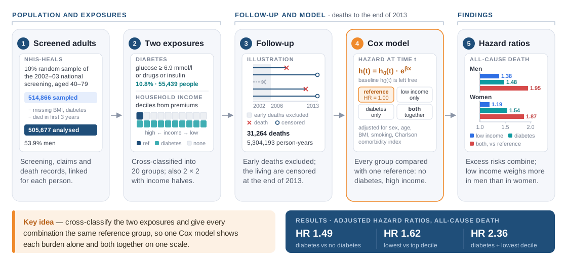
The study used the National Health Insurance Service–National Health Screening cohort (NHIS-HEALS), a 10% random sample of the adults aged 40–79 who took part in the free national health screening in 2002 and 2003, followed to the end of 2013. After removing people with missing BMI or diabetes status and anyone who died in the first three years of follow-up, 505,677 adults remained (53.9% men). Of these, 55,439 (10.8%) had diabetes at baseline, defined as a fasting glucose of at least 6.9 mmol/l or treatment with glucose-lowering drugs or insulin. Income came in ten levels from insurance premium records, and deaths from the national registry: 31,264 over 5,304,193 person-years.
After adjustment for sex, age, BMI, smoking and comorbidity, diabetes was associated with a 49% higher hazard of death and the lowest income decile with a 62% higher hazard than the highest. People with diabetes in the lowest decile had 2.36 times the hazard of those without diabetes in the highest. In men the two burdens were similar in size and stacked up (hazard ratios 1.38 for low income only, 1.48 for diabetes only, 1.95 for both); in women diabetes weighed more and low income less. I was one of the analysts on the team: I worked on the Cox proportional hazards models for diabetes, income and their combination, examined how the two exposures interact, and reviewed and revised the article. Below: the cohort design, why a Cox model fits this follow-up, and how a joint-exposure reference group makes the interaction question readable.
A screening cohort read as survival data
Three design choices shape everything downstream. First, both exposures are measured rather than self-reported: diabetes from the screening blood test plus prescriptions in the claims, and household income from the salary and asset information the insurer uses to set premiums. For privacy, researchers received only the category, in ten insurance deciles (the 0.10% on medical aid were merged into the lowest), and for the sex-specific comparison income was also split into lower and upper halves.
Second, the three-year exclusion window. People who are already seriously ill tend to lose income and die soon, which would make low income look deadlier than it is. Excluding deaths in the first three years reduces this reverse causation, the authors' stated aim, at the cost of a shorter outcome window (2006 to 2013).
Third, the outcome is time to death, not a yes-or-no flag. Most participants were alive at the end of 2013; their follow-up is censored, so we know only that they survived at least that long, and a survival model uses exactly that instead of dropping them or counting them as survivors. Causes of death were grouped by ICD-10 code into cardiovascular, cancer and other. The same cohort, with exercise frequency as the exposure, is the subject of the companion write-up on exercise and mortality.
Why a Cox proportional hazards model
A Cox model describes each person's hazard, the instantaneous death rate at time t given survival up to t, as a shared baseline hazard multiplied by exp(β·x), where x holds that person's exposures and covariates. Two properties make it the standard tool for a cohort like this.
It is semi-parametric. The baseline hazard, which in an ageing cohort rises over the twelve years, is never estimated or given a shape. The model is fitted by partial likelihood: at each death it asks how likely it was that this particular person, rather than anyone else still under observation, was the one to die. Only the ordering of deaths and the membership of these risk sets matter, so censored people contribute naturally, sitting in every risk set until they leave the data, and the baseline hazard cancels out.
Its output is a hazard ratio, exp(β), which is assumed to stay constant over follow-up: the proportional-hazards assumption. With adjustment for sex, age, BMI, smoking and the Charlson Comorbidity Index (17 claims-based conditions scored 1 to 6 by severity), the hazard ratio of 1.49 for diabetes means that at any point in follow-up a person with diabetes had about one and a half times the death rate of a comparable person without it. The article shows Kaplan–Meier curves for the four combined groups, the usual visual companion to that assumption, but reports no formal test such as one based on Schoenfeld residuals.
Covariate adjustment cuts both ways in this question. Smoking, obesity and comorbidity are confounders, but they also lie on the path from low income to early death, so adjusting for them can remove part of the effect the study is trying to measure. The team therefore refitted the models with sex and age only: the hazard ratios grew slightly and the income gradient kept its shape, so these factors carry part, but not most, of the excess mortality of low income.
One reference group for two exposures
The core of the analysis is the joint-exposure design. Instead of entering diabetes and income as two separate terms, each person is placed in one cell of a cross-classification, 2 diabetes states by 10 income levels for 20 groups, or 2 by 2 with income halves, and the Cox model estimates one hazard ratio per cell against a single reference: people without diabetes in the highest income group. Every effect then sits on one scale: the single-exposure cells show each burden alone, the joint cell both together, all with the same covariates and comparison group.
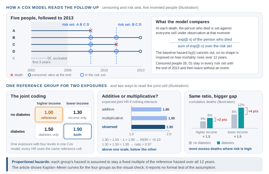
A table like this invites the interaction question, and the answer depends on the scale. On the ratio scale, diabetes added roughly 50% to the hazard at every income level, a fairly constant relative effect. On the absolute scale the picture changes: because people with low income die at higher rates to begin with, the same relative increase means more deaths. The gap in cumulative mortality between people with and without diabetes was 7.59 percentage points in the lowest income decile against 6.50 points in the highest. The article calls the combination synergistic on the strength of the joint estimates; it did not report a formal interaction measure, such as a product term for the multiplicative scale or the relative excess risk due to interaction (RERI) for the additive one.
Sex was handled by fitting separate models for men and women, which lets every coefficient, and the baseline hazard, differ by sex. A test of the difference between men and women gave P < 0.0001 for all-cause mortality and P = 0.43 for cardiovascular mortality.
Results
| All-cause death, adjusted HR (95% CI) | Men | Women |
|---|---|---|
| No diabetes, upper-half income | 1.00 (reference) | 1.00 (reference) |
| No diabetes, lower-half income | 1.38 (1.34–1.42) | 1.19 (1.14–1.24) |
| Diabetes, upper-half income | 1.48 (1.42–1.55) | 1.54 (1.44–1.64) |
| Diabetes, lower-half income | 1.95 (1.86–2.05) | 1.87 (1.75–2.01) |
Across the whole cohort the income gradient was continuous, rising step by step from the top decile to 1.62 (1.55–1.70) in the lowest, and the 20-group analysis put people with diabetes in the lowest decile at 2.36 (2.19–2.54). The pattern held for every cause of death, strongest for causes other than cardiovascular disease and cancer (2.62, 2.44–2.82, for men with both exposures) and weakest for cancer (1.43, 1.32–1.55). Claims data hinted at why income still mattered under universal coverage: among people with diabetes, medication adherence, HbA1c testing and eye examinations all rose with income.
What I learned
A shared reference group makes a joint effect readable. Fitting diabetes and income as two main effects would have produced two adjusted hazard ratios and no direct estimate for people who have both. Coding the combination as one categorical exposure costs a few parameters, trivial with half a million people, and yields a table anyone can read.
Interaction is scale-dependent, so name the scale. The same data read as a roughly constant relative effect of diabetes on the ratio scale and as more excess deaths among the poor on the absolute scale, and the second is usually what matters for public health. If I ran this analysis today I would report both explicitly: a product term in the Cox model for the multiplicative scale, and RERI with a confidence interval for the additive one.
Adjustment is a causal decision, not a formality. Smoking and comorbidity are confounders for one question and mediators for another. A minimally adjusted model beside the fully adjusted one shows cheaply how much of the effect they carry, and I now fit that pair by default whenever an exposure sits upstream of the covariates.
Limitations
- The cohort covers people who attended national screening (43.2% participation in 2003), who tend to be employed, better off and more health-conscious; the results may not transfer to unscreened adults or to other health systems.
- HbA1c values and diabetic complications were not available, so disease severity and control could not be assessed; comorbidity came from claims and may be under- or misdiagnosed.
- Household income was not adjusted for the number of household members, the effects of health behaviours and comorbid conditions were not fully evaluated, and measurement was not fully standardised across screening centres.
All numbers come from the published article in Diabetic Medicine (2018). The figures are my own drawings, not reproductions of the article's figures, and values marked as illustration are invented. No individual-level data from the cohort are shown or shared.